Miscellany

Herein there lies a tale. Back in the 1990s, a friend of mine went out to the San Fernando Valley to help out a friend of his who was in failing health. The friend had effectively inherited a company which had developed, and continued to produce and sell a whole line of herbal medications to alternative medical practitioners. My friend never did return from the Valley.
His friend’s business was left in a particularly awkward transitional state at the point of his death. By that time, the company had been running, with some degree of success for about 18 years, but none of the prior partners (all deceased) had ever gotten around to sorting the business end of it out in such a manner that the records would have been coherent enough to withstand any sort of official scrutiny had the necessity ever come up. The last partner, my friend’s friend, had finally, belatedly, made a start on that process. His death, consequently, left matters even more wildly incoherent. His family had no wish to open that particular can of worms.
My friend, not knowing what he was letting himself in for, stepped into the breech.
He had no practical experience in running an operating business either, and the ensuing decade was a very bumpy ride, which, after a number of wrong turns and cul-de-sacs in the transition from analog to digital records-keeping finally seemed to be drawing to the end of the “transitional” phase of the company's history.
One of the issues which emerged very early in the drive to full accountability was the need to bring the company's product labels into compliance with FDC regulations.
This is where I got pulled into the vortex and embarked upon the Project from Heck.
We ended up spinning our wheels for a few months before the project could properly start, since, first we needed to know just what the specific regulations were for products of the specific type that the company produced, and how they needed to be formatted. And of course from our end of this particular tunnel nobody involved in the project knew quite what they were doing.
That the label redesign element of the project was also completely entangled in a concurrent attempt to streamline and improve the management of inventory and to create a coherent company-wide reference system did not help to expedite matters.
Well it was a “very pretty problem”.

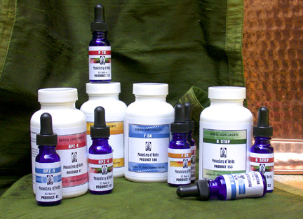
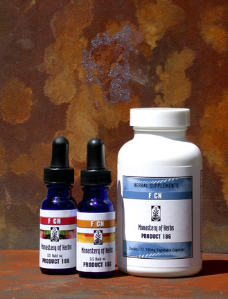
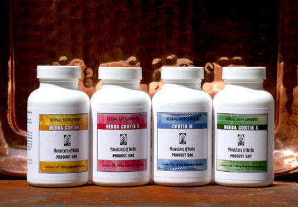
My end of the Project was the easy one. I was strictly involved in the label design. This was quite sufficiently complex, since each roughly 3" x 6" label had to fit into that space an FDC-specified supplement facts panel, a list of the FDC specified cautions on the use of the product’s ingredients where applicable, a front panel identifying the product (both by name and product number), as well as the company logo and contact info. Furthermore, all typography in the FDC-required information also needed to fall with in an FDC-specified range of point sizes. There were also the tincture labels which accompany the dry herbal blends, since these are sold in sets. Those labels also had to be created.
Plus, we wanted it all to look good.

It wasn't until December that we had enough of the ducks in a row for me to start putting it all together. And, of course, this hit a few more bumps when something in either the reference, or the inventory end of the equation dictated changes.
And, as you might expect, the checking process once I had the prototypes ready was a nightmare.
Finally, my end of it all came together. Their end of the team managed to give me the corrections for all of the labels and there was no further reason to put off my going out to the Monastery for a weekend and putting in the necessary drudgery of porting the files over from my traveling hard drive to the Dell in the herb room.
I figured that porting over 423 files would take all weekend, too. I was wrong. I underestimated.

The major slow-down was that FreeHand MX on the Dell would not link files automatically. On my Mac at home, if I had a file with a lot of placed TIFFs and moved them from one disk to another, the first time I opened a file it would ask where the TIFFs are. One then navigates to the folder where the TIFFs live and check the box that tells the program to check this folder for the missing links and select the first one, and it automatically would link to all of them.
On the Dell, it ignored the check-box. Completely. Or at least it ignored it on that Dell. Which meant that I had to relink every instance of every TIFF. Some of which required linking the same TIFF to a single file up to 28 times.
While the computer thought about it.
And when I was finished with that, I had to update the fonts in every file — since the last time those files had been opened they had been on a Macintosh (in FreeHand 10, NOT FreeHand MX). And, then, just to be obnoxious, about every 10–20 files or so, the bloody program would decide to claim it had found an unknown instruction and refuse to open the file after I had just gotten through linking all the TIFFs and updating all the fonts. Which required quitting out of FreeHand and relaunching.

Which wouldn’t have been so bad, except that I was also printing out these files as I finished with them and every time I relaunched the program I would lose my color settings and have to try to remember to reset them. Or everything in the hardcopy went screwy with color shifts.
And then we discovered that some of them hadn’t ported over quite as smoothly as we thought and I had a slew of those stupid missing character symbols that I had to go back and delete. And then the next day it turned out that the proofreader hadn’t really understood what I was asking for and had not been porfreading them correctly, so we found we had a lot of wandering hyphens and all kinds of other screwiness where the text had squirmed and twitched in the transition and I had to go back and correct all of those, too.
It took three days.
Long days
But I think that it looks pretty good.

This wasn’t the first time I had gotten involved in a label project for the Monastery. In addition to the herbal blends that the alternative health practitioners prescribe to their patients, the Monastery also has a test kit of their products which is sold to the practitioners themselves.
When my friend first became involved in the company these test kits were packaged in a set of large flat boxes with lids that were close to 9" x 12" and took full-sheet labels. Rather dorky full-sheet labels at the time. We put a good deal of work and colaboration into addressing this problem. We did one version, and then we ran with it, producing a pair of ornate, old-fashioned “cigar box” style labels for these flat boxes. We both thought they were pretty spiffy, but as my friend got more involved with the minutia of running the business, by the time we were ready to put the new labels into commission, it had become plain that he had a continuing problem with damage in shipping the test kits, because the packaging simply wasn’t sturdy enough to protect the contents.

Eventually, the test kits were repackaged in a much more sturdy and compact set of boxes (ammo boxes, actually) which required a different type of labeling altogether. Ultimately the labels developed for the new test kits set the general “high-tech” style which, as you can see, has been carried over (as much as possible) across the board on all Monastery products. Most notably those in the Project from Heck.
