Selected Classwork


We weren’t working with Ink for very long. Just under a month, in fact. And we had only a handful of assignments using it.
Three of these were using still life setups in the classroom. A stipple exercise, a cross-hatching exercise, and an ink wash exercise. After the ink wash exercise we were to go back and add ink wash to our earlier stipple and cross-hatching exercises.
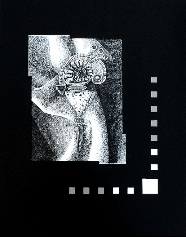
Then we were to mount them. Not just stick them on a piece of illustration board. We were to cut windows, and stick the art inside the windows. At least, thank ghod, we didn't have to cut windows in illustration board. We could use heavy paper. I got rather arty-farty with the mounting part of it. I can at least cut holes in paper.
For our ink midterm we were to get the instructor’s approval on a subject and then decide whether to use either stipple or cross-hatching to produce it (not both), at least at letter size, and then mount it in a finish size of something like at least 15x20.
I had rapidly come to the conclusion that I seriously dislike ink wash. Paint and I have never gotten on well, and ink wash is everything that I most dislike about paint. But the assignment required it.
Well, okay, let’s see how well I can make an argument against ruining my perfectly good stipple work with a lousy ink wash. So. The point of ink wash is to add tone to a flat black and white image, right? Agreed?
Ink wash consists of various dilutions of ink and water, right? No argument there either.
Nothing about that says it has to be applied with a brush.
I applied my ink wash with a pen.
It took about four times longer, but it didn’t screw up my stipple work. And since it was the ink wash, not the drawing, I experimented a bit. Most of it was applied as stipple work, but there are a couple of places where I used hatching (not cross-hatching). There are a couple of places where I dabbled it on with the pen handle — which wasn’t a good idea, but too late, it was in, and I couldn’t take it out.
Of course I’d already made my major mistake on this assignment by using a page of the same sketch pad we’d been using all semester, instead of using some of the end of the Bristol pad I’d used for Art 501. Bristol stock is designed for pen and ink. The sketch pad says right on the cover that it's intended for dry media. So I ended up with a warped and wavy mess. I sprayed it with water and pressed it under a stack of books overnight, which did help, but it's still far from flat. Nevertheless, I was very pleased with how it ended up.
